
Artículo: What Actually Makes a Premium Graphic T-Shirt
What Actually Makes a Premium Graphic T-Shirt
I've been in the apparel business for over 25 years. Before that, I was tattooing, and before that, I was drawing — basically, my whole life has been spent thinking about what makes something worth wearing, worth hanging on a wall, worth putting on your body permanently.
So when I hear the phrase "premium graphic t-shirt" thrown around, I have opinions.
The word "premium" is used to justify a price point more than it describes an actual product. I've seen $80 tees that feel like a paper towel after three washes. I've seen the graphic crack and peel before the shirt even breaks in. I've seen brands put incredible art on a blank that doesn't deserve it — and the art suffers for it.
At Sullen, we've spent the last two decades trying to get this right. Here's what I've learned.
The blank is the foundation
A graphic t-shirt is only as good as the canvas it's printed on. This sounds obvious, but most brands never talk about it because they're buying commodity blanks and hoping the graphic carries the product.
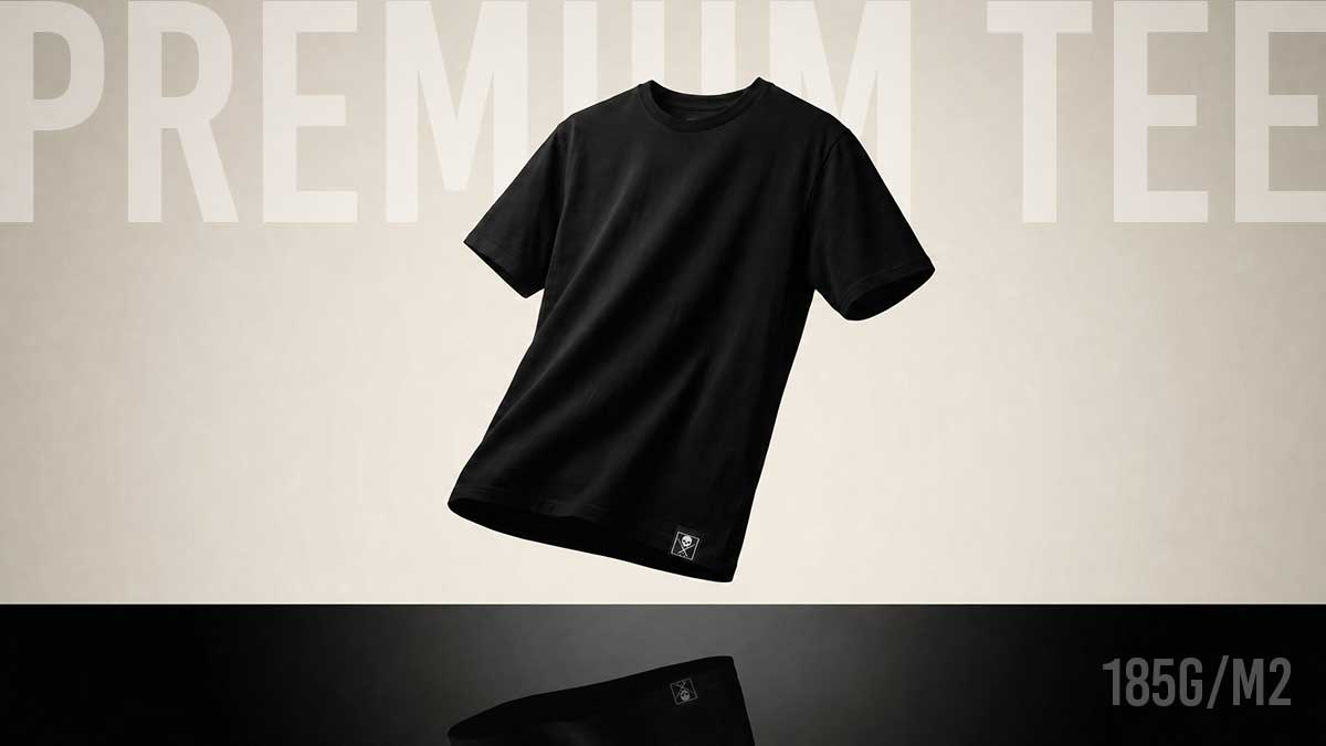
We run three blanks. Our entry point is a solid ringspun cotton tee — clean, reliable, does what it's supposed to do. Our mid-tier is a custom ringspun PFD blank — prepared for dyeing — which means we dye the fabric ourselves in specific colorways, so our prints land differently than they would on a standard dyed blank. The color goes into the fabric, not just onto it.
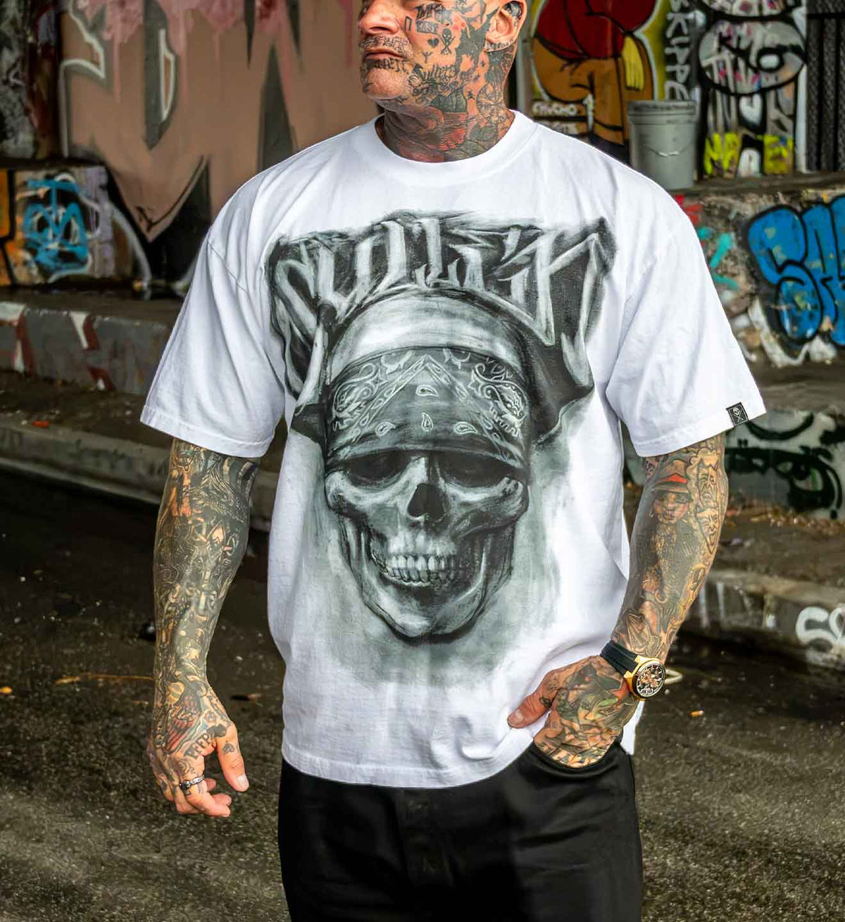
Our heavyweight — the 1Ton — is 7.6 ounces, double-washed, side-seam construction, drop shoulder. It drapes differently. It has presence. When you pick it up, you know immediately it's not the same thing you've been buying everywhere else.
The print has to be built for the blank
We work with Massive Prints, our screen print vendor, and every piece of art that goes on a Sullen tee is separated and printed specifically for the blank it's going on. The ink deposit, the hand feel of the print, the way color sits on a custom-dyed fabric versus a standard tee that is typically only offered in a limited amount of colors — all of it gets considered.
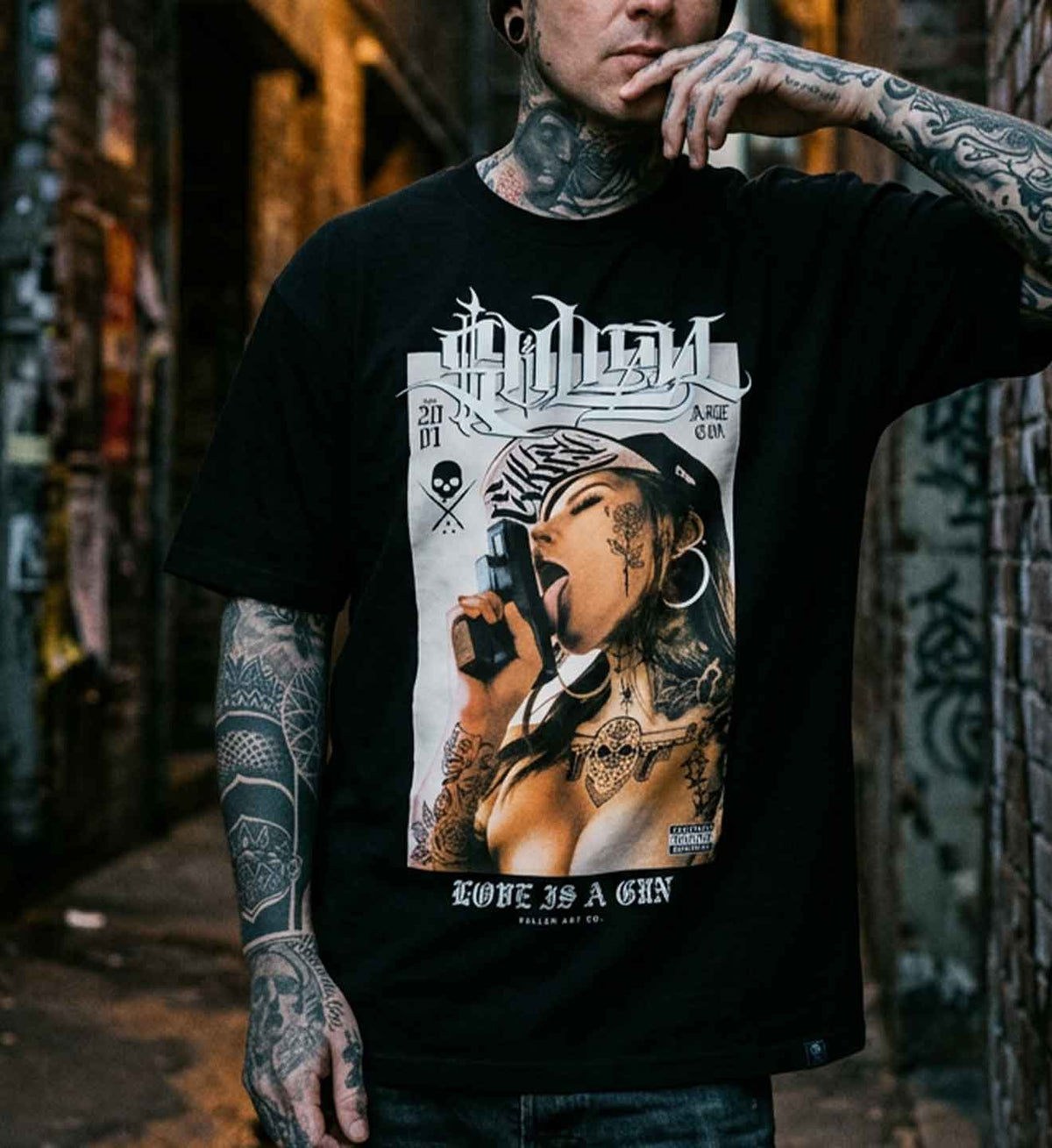
We work with some of the best tattoo artists in the world. People like Carlos Torres, Nikko Hurtado, and Joseph Haefs. Their work is too good to be treated as an afterthought on a bad blank.
It has to hold up
A premium graphic t-shirt should look better after twenty washes than it did on the shelf. That's the test I use. The 1Ton double-wash process means the fabric has already been through the stress — it's broken in before it gets to you. The colors are settled. The weight is consistent. There's no shrink surprise.
That's what premium actually means to me. Not a price. Not a marketing word. A shirt built to last longer than the trend that sold it.
If you want to see what that looks like in practice, start with the blank. Everything else follows from there.
Ryan Smith is the co-founder and Creative Director of Sullen Art Collective. He has been tattooing since he was 19 and has spent 25 years building one of the most recognized names in tattoo culture apparel.

De Ryan Smith